
Design System Update
Project Type
Design system
Industry
SaaS / Management software / Sport clubs
Role
Product designer
Challenge
Kurabu’s design system had become fragmented: components weren’t clearly structured across web, mobile, and shared features, translation workflows were manual and slow, and colour usage was inconsistent between design and dev.
The system needed clarity, efficiency, and a structure that could grow with the product.
outcome
I restructured the system and added key improvements: variables for translations, component states, and semantic colours; reorganised or created components where needed; and aligned colour tokens with engineers. These updates cut handoff prep time by >60%, sped up design work, reduced copy mistakes, improved consistency, and prepared the system to support new languages and features.
Skills
Figma
Variables
atomic design
design system
Overview
context
Kurabu was growing fast, but the design system lagged. Components were inconsistent, translations lived outside Figma, and colors didn’t match what devs used. With no PM or CTO to call this work, I made the case to pause features and update the system.
This case focuses only on the updates I led and why they mattered.
my role
I led the DS reorganisation in Figma: introduced variables for translations, states, and semantic colors; rebuilt or created components; aligned color tokens with engineers; and ran workshops to ensure adoption.
Genesis
Audit
I led the DS reorganisation in Figma: introduced variables for translations, states, and semantic colors; rebuilt or created components; aligned color tokens with engineers; and ran workshops to ensure adoption.
When Figma released variables (Config 2023), I tested them and saw they could solve a lot of our issues.
Key insights
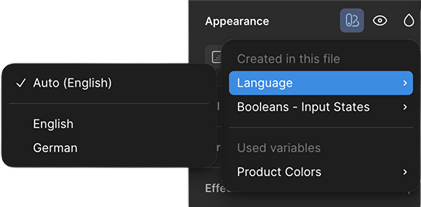
Translations: manual lookup was slow and easy to miss during updates.
Components: variants were bloated; switching states could break or lose content.
Colors: designers used tokens, devs used hex; no shared reference.
Docs: usage rules were missing.
Handoff: Jira duplicated Figma and added friction.
process

Research to-do:
- Audit existing DS
- Map dev naming & structure
- Explore Figma variables


Define to-do:
- Prioritise actions
- Align with engineering

Build to-do:
- Clean & restructure
- Create variables (translations, colors, states)
- Add/refresh components
- Document usage

Transfer to-do:
- Run design workshops
- Train devs on new flow
sub-atomic
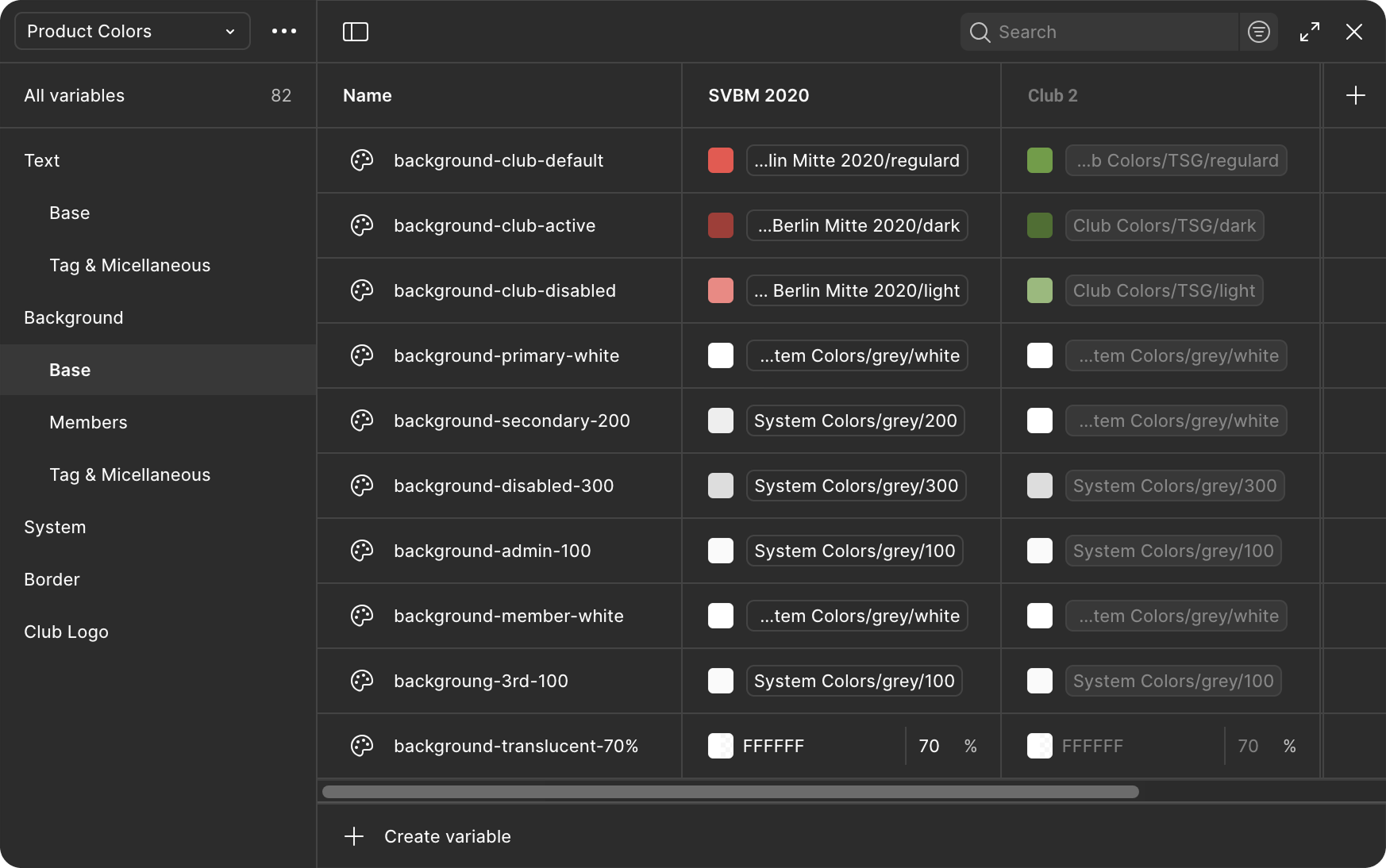
colours
Why
Our colour system had drifted. Designers used token names, developers used hex codes, and every Jira ticket had to mention both. Choosing colours, especially for new elements, meant relying on memory rather than guidance, and there was no easy way to test branding variations.
Execution
Rebuilt the color library around semantic variables that describe purpose instead of value. Added modes for different club brandings (default Product = SVBM 2020, test mode = Club 2) and synced naming with developers. Added usage notes to the Color Styles in Figma to clarify how each color should be applied.
Impact
Design and development now share one color language. Switching between brand themes takes seconds, accessibility checks are faster, and the variable structure is ready for future expansions like dark mode.
atomic
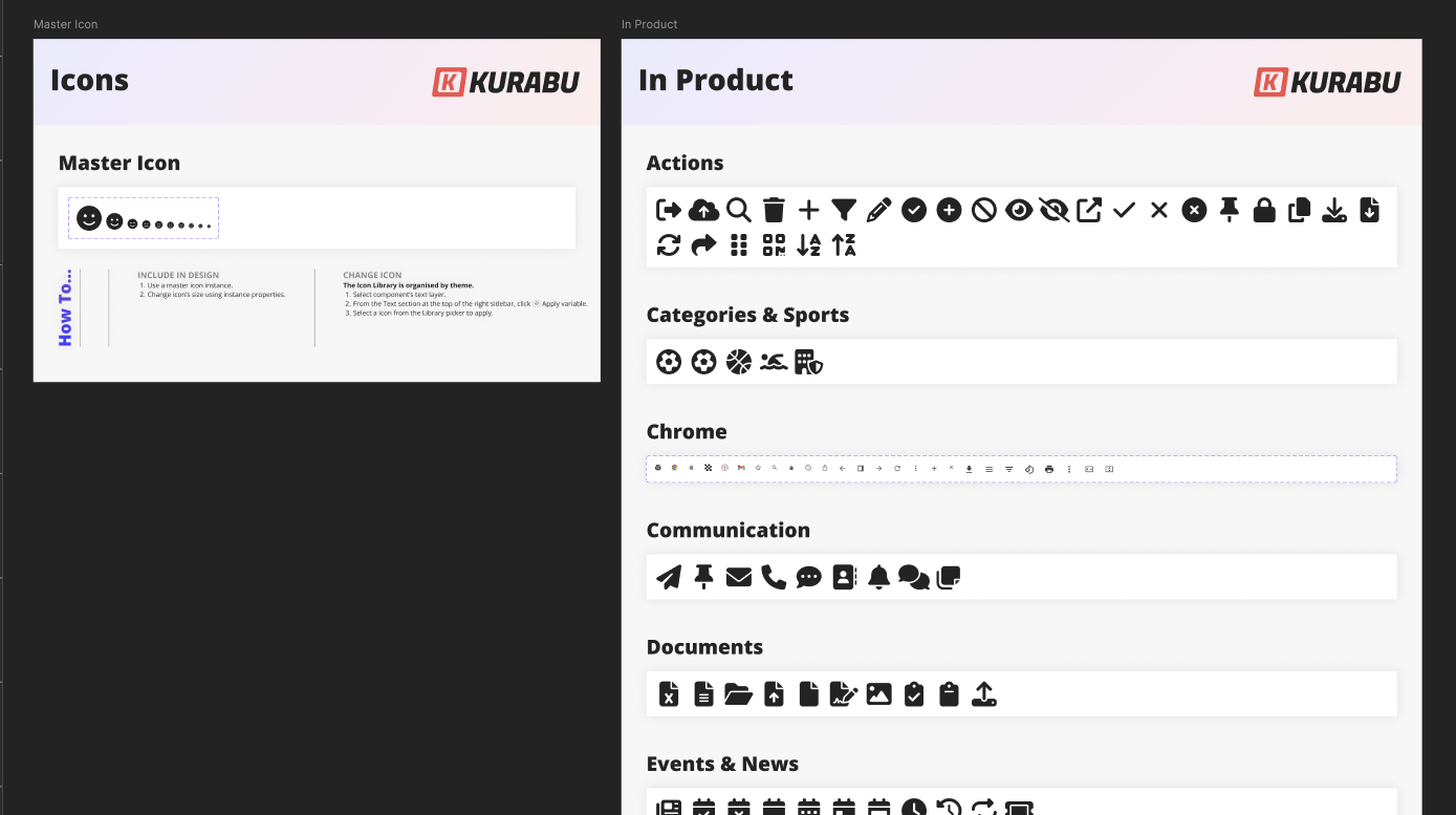
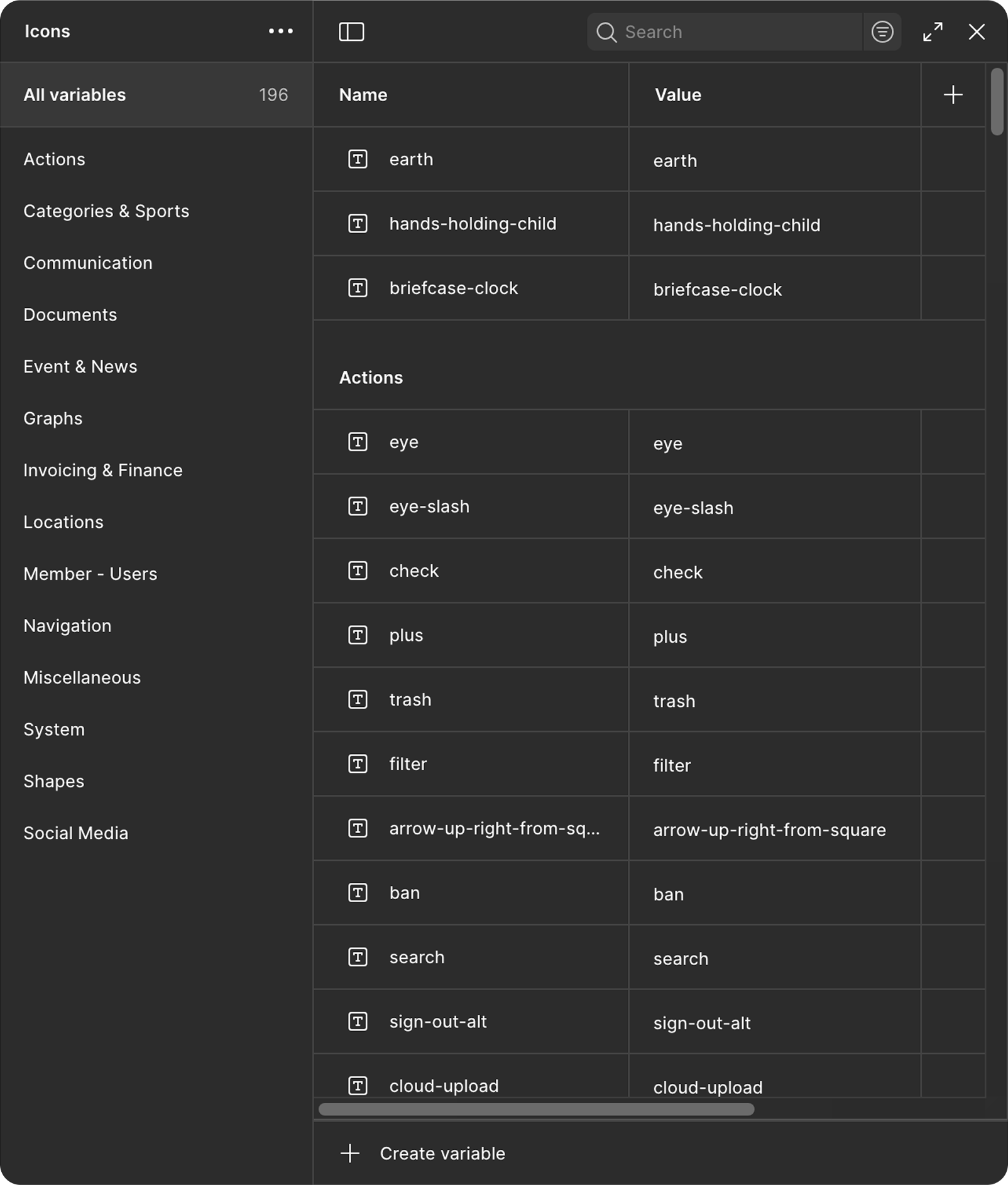
icons
Why
We used Font Awesome, but the icon list wasn’t fully maintained or documented, and the main component wasn’t functional. We had to resize it manually (via font size) and weren’t sure which icons were current.
Execution
Created a master icon component with size variants, built a variable library of icon names grouped by theme, and added usage notes for clarity.
Impact
Consistent icon sizing, easier browsing, and a system that’s simple to maintain as icons evolve.
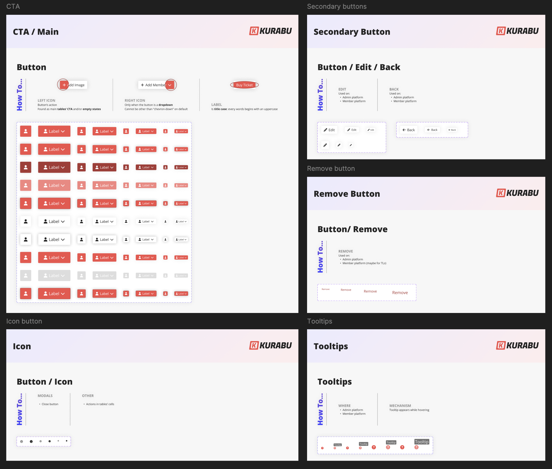
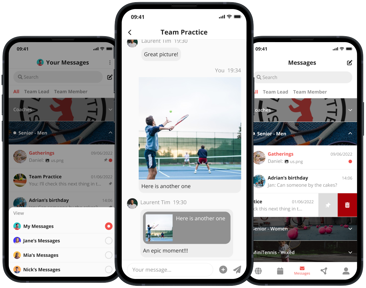
buttons
Why
All button types lived inside one oversized component with 120+ variants. Switching between types often broke content, and there were no clear usage rules.
Execution
Split buttons into Main, Secondary, Remove, Icon, and Tooltip components. Rebuilt architecture to preserve content across states and added an in-Figma “How to” showing best practices. Integrated fixed translations for recurring labels like Edit, Back, and Remove.
Impact
Lighter components, faster prototyping, and consistent buttons across platforms: all with built‑in translations and clear documentation.
tags
Why
The existing tag component didn’t scale. Designers had to manually pick colors and icons each time, and it wasn’t obvious which combinations were correct for a given use. As more tag types appeared across the product, keeping them consistent became harder.
Execution
Started by building a main tag component with all valid colour and icon variants, including icon-only options for compact use. From there, I created type-specific components (for example Member Status tags) that nest the main tag and contain only the relevant variants: Active (green), Inactive (red). I embedded translations thanks to variants modes directly inside each defined tag since their wording never changes.
Impact
Designers now work with predefined, self-documenting tag sets: colours, icons, and labels are all linked. This makes it instantly clear which visual style matches which tag type, while ensuring wording and colour use stay consistent across the product.
input fields
Why
Designing with inputs was slow and fragile. Components defaulted to placeholder text across states, with actual input only visible in the active state. Switching states often cleared content.
The disabled state had low contrast: grey-500 text (#919191) on a grey background (#DDDDDD) yielded a 2.32:1 ratio, below recommended thresholds.
Execution
Rebuilt the base structure of all input elements with variables allowing to switch between placeholders and inputs without losing content on all of the component states (idle, hover, selected, disabled, success and error).
For accessibility, I changed disabled text to grey-600 (#707070) on #DDDDDD, improving contrast to 3.65:1.
Impact
Inputs are now stable, readable, and accessible across every state. Designers can preview any condition instantly, and disabled fields remain legible while still visually distinct. The result is faster design using forms and a stronger foundation for accessibility across the product.

Old disabled state:


New WCAG-compliant disabled state:


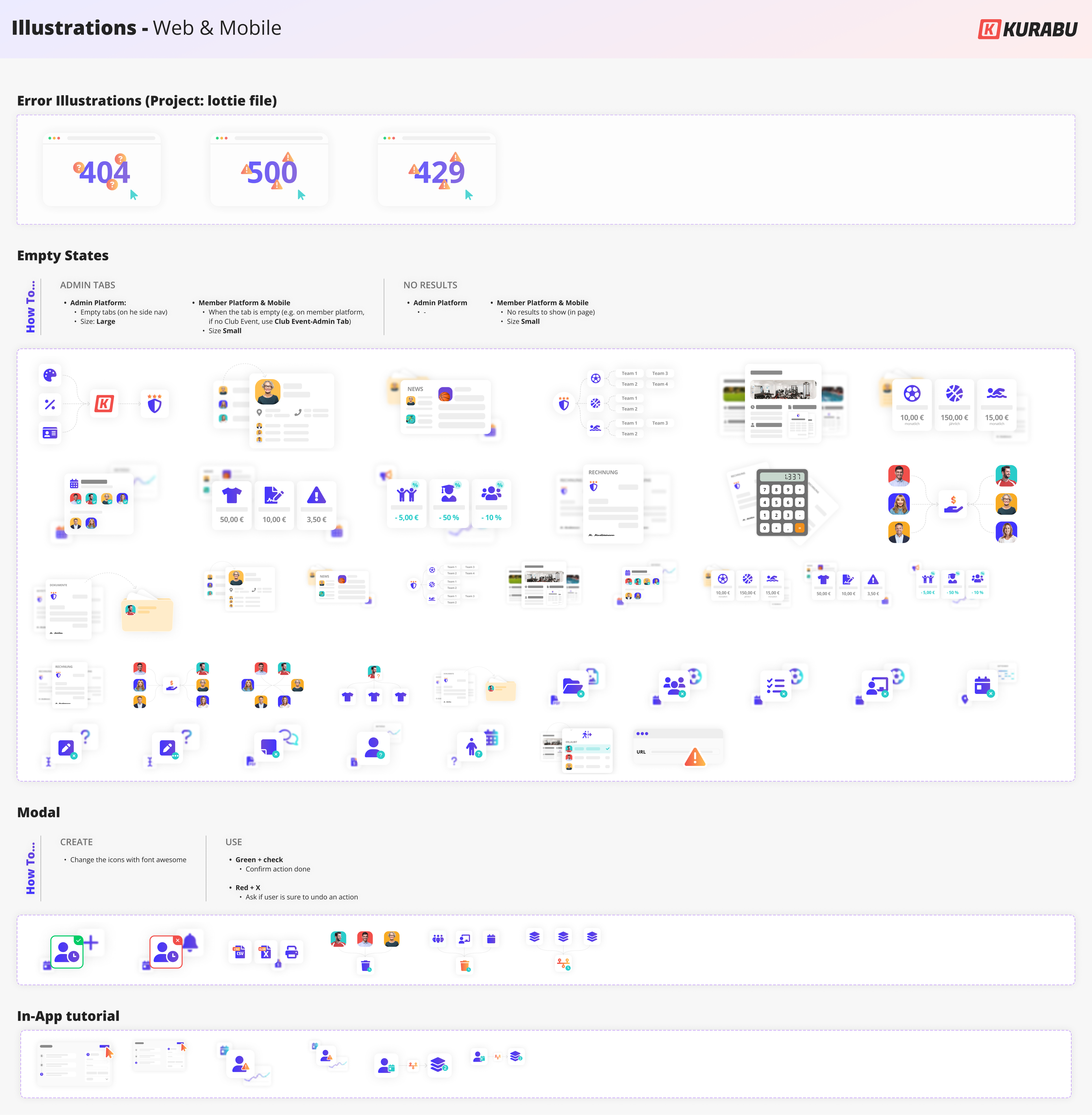
illustrations
Why
Illustrations appeared everywhere, from product empty states and modals to marketing visuals and fundraising slides, but they lacked structure. All existing illustrations were stored in a single file with unlabelled and undocumented elements, making it hard to know what already existed, how to use them, or how to create new ones.
Execution
I cleaned up and rebuilt all illustrations as organised Figma vector components, adding size variants for desktop and mobile. I also sorted them by use: product (empty states, modals, tutorials); marketing; or social media, and documented how to build new ones using the same visual base, for example linking modal illustrations to their related message type.
Impact
Designers can now create and update illustrations quickly while keeping a unified visual language. The shared base ensures consistency across product and communication visuals, and the organised structure makes it easy to scale as new needs appear.
molecular
Grouped input fields
Why
Grouped inputs like addresses or date pickers required repetitive setup. Translating date names or re-creating labels and empty states each time was tedious and unnecessary.
Execution
Added labels and empty states to the translation variable library for all common grouped input fields, such as address inputs and date/time pickers.
Impact
The design flow is now much faster, as frequently used input fields no longer need rewording. This also ensures complete consistency across the product.
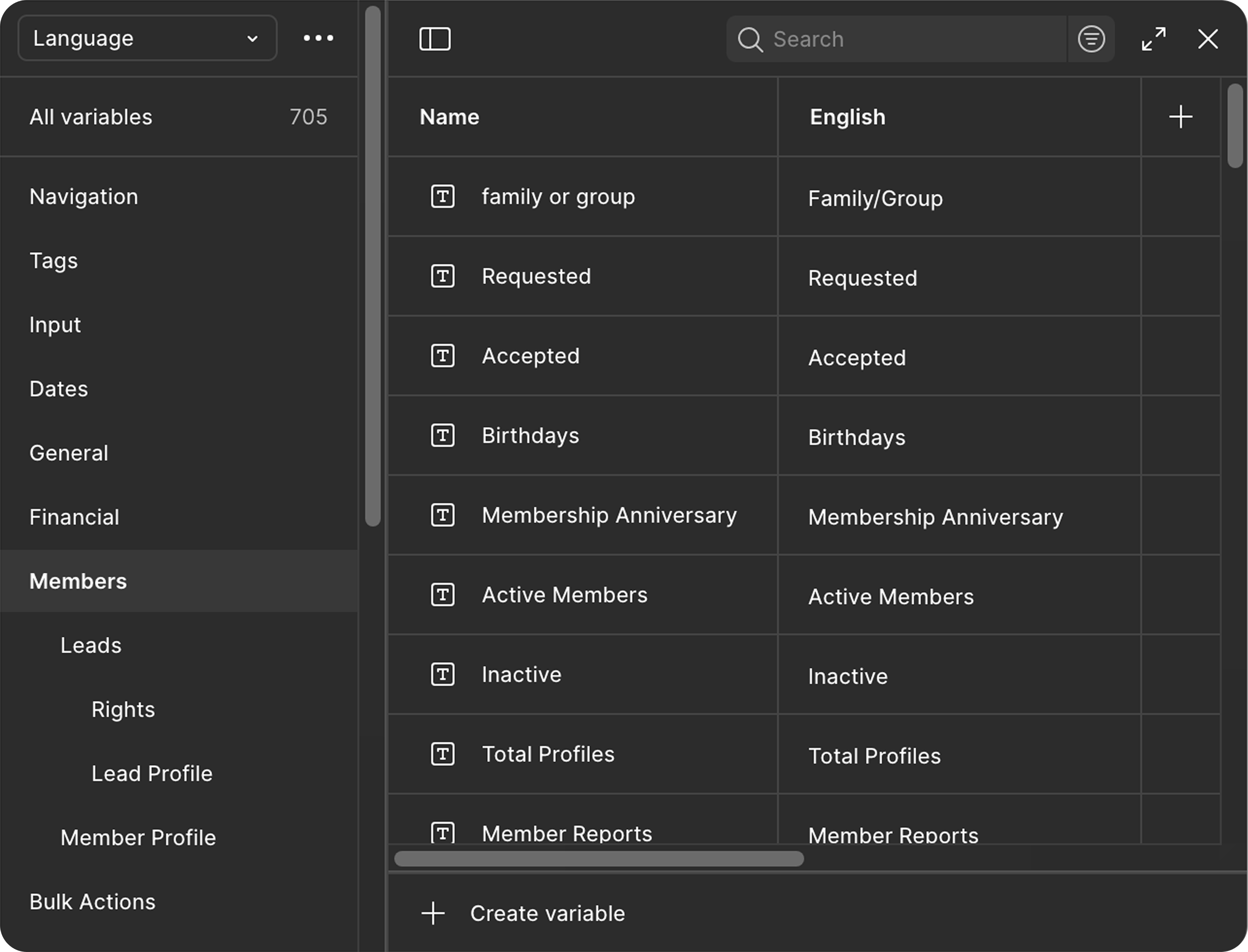
feature-based translation
Why
Feature-specific translations weren’t centralised. Some were hidden in Figma files, others buried in Excel or only visible in the live product, which made updates slow and unreliable.
Execution
Built a structured translation library sorted by product tab. Each feature has its own variable set for organism-level translations. Tables have a dedicated section with shared entries and table-specific headers.
Impact
All product copy now lives in one organised source of truth in Figma. Updates happen once, and translations stay consistent across every feature.

adoption & impact
knowledge transfer
After restructuring the design system, it was essential to make sure the team could use and expand it confidently. Variables and new component logic were completely new to everyone.
I ran hands-on workshops with the other designer to explain how variables worked, how to use and document new components, and how to expand the system consistently.
new Handoff process
When I asked the developers about their design system and ours, I realised they didn’t actually know how to use Figma Dev Mode. That’s when it clicked why we were spending so much time writing long Jira tickets; we were duplicating what Figma already provided.
While working on the design system update, I noticed we were spending hours writing long Jira tickets that repeated what was already in Figma. When I asked the developers about their workflow, I realised they didn’t really know how to use Figma Dev Mode, and suddenly the extra effort made sense.
I sat down with my design teammate to share pain points, then reached out to PMs and Heads of Product in my network to see how other teams handled handoff. With those insights, I drafted a new process that we refined together. Once everyone was on board, I ran a workshop to teach the developers how to use Figma effectively and walked them through the new workflow.
Now, Jira focuses on backend logic and technical details, while Figma is the single source of truth for UI, interactions, and translations.
impact
The design system update drastically reduced design time and created a solid foundation for consistency across the product. Having a single source of truth for translations and UI elements became a real game changer for both design and handoff.
The unexpected but necessary handoff change cut prep time by over 60 % (and up to 90 % for UI‑focused tickets), which was especially useful during the UI transition and React migration.
After more than a year, both are still in place and running smoothly, speeding up daily work and keeping design and development perfectly aligned.
afterwords
This project made me more methodical and confident in my instincts. Both the design system and the handoff updates were my initiative, and seeing their impact proved how much quiet, foundational work can shape a product.
Rebuilding core structures right after Figma Config 2023 was challenging. I had to design a colour token system and translation library while still learning how variables worked.
Next, I plan to refine both: simplify colour naming, review the translation structure as the product grows, and keep the system maintained so it stays scalable and alive.
It is the kind of invisible work that makes everything else move faster.
other Projects
Automated Plans
Project Type
Feature design – invoicing automation
Industry
SaaS / Management software / Sport clubs
Role
Sole Product Designer (from discovery to delivery)
Challenge
Design a customizable automated invoicing system that could adapt to diverse club pricing rules, while integrating seamlessly with the existing platform and staying realistic for limited dev resources and timelines.
outcome
I delivered selective redesigns and an MVP invoicing automation feature, including a scalable rule builder, mass actions for seasonal changes, and robust error/anomaly handling. I also proposed a roadmap for future iterations beyond the MVP.
The MVP alone is expected to save clubs ~15 hrs/week of admin work and reduce invoicing errors by 70%.
Skills
UX research
UI design
Information architecture
prototyping
Overview
Automated Plans was built to take the pain out of subscription management for sports clubs. Instead of relying on manual updates, the system automatically adjusts member plans by age or group, but stays flexible so every club can match its own pricing structure and rules.
process
Research to-do:
- Survey & inteviews
- Pricing structure mapping
- Product Audit
- Competitors analysis
Define to-do:
- Problem statement
- Vision & UX Strategy
- Primary redesign definition
- MVP Scope

Ideate to-do:
- Technical exploration
- Dev team consultation
- Brainstorming
- Sketch

Design to-do:
- Logic design & documentation
- Primary redesign
- Components creation
- UX/UI refinement

To deliver:
- High-fidelity frames
- Interactive prototype
- Handoff to dev team
research
goal
Understand how clubs manage pricing, their main pain points, and how automation could improve the process. I also wanted to assess how these challenges and mistakes affect the Dev Team's workload.
Methodology
I began with a survey targeting club managers, followed by interviews with the Sales and Dev Teams. I then analysed pricing structure from clubs of various sizes to identify common patterns and key differences. Finally, I conducted a competitor analysis and audited our current product.
Key insights
What is a plan?
Plans define what members pay based on conditions like age, family status, employment, or income.
How club manage the situation
Currently, plans are managed manually or with Excel, which is time-consuming and prone to errors.
Clubs often juggle multiple databases.
competitors
None of our competitors offer a satisfying solution.
Only Campai includes a plan management feature, but it lacks thoughtful design, clubs still find it frustrating and insufficient.


Common pricing pattern
Pricing is usually fixed per bracket, not percentage-based.
Clubs expect automated plan changes based on age, especially at age 18.
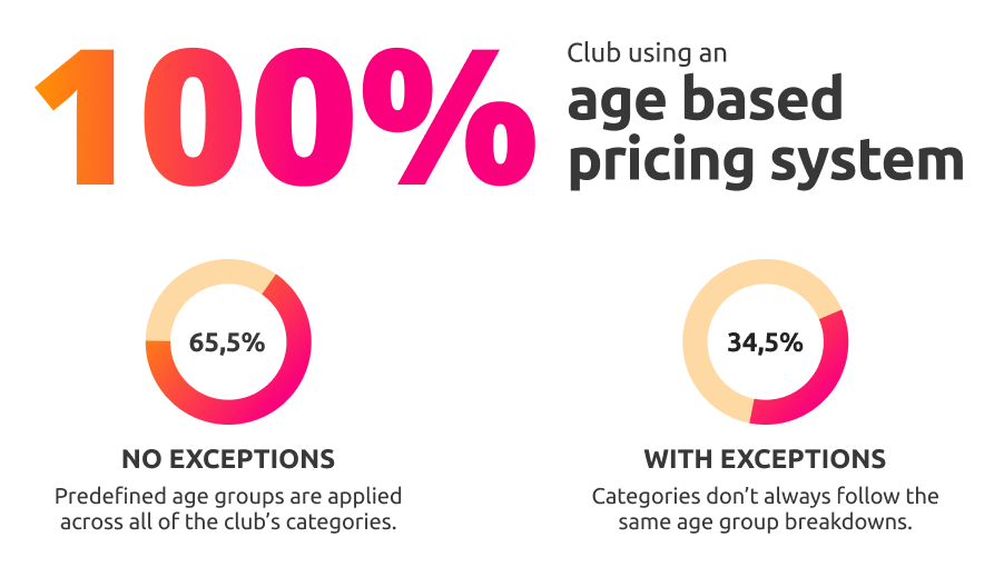
Club's pricing structures backbone
The factors that determine which price or plan applies to a member generally follow a core structure, with some clubs adding extra layers based on their specific needs.
Club Pain Points Become Dev Team Bottlenecks
Club pain points result in repetitive sales requests like bulk member additions, setting plan end dates, or editing plan frequency, pulling the dev team away from building new features and slowing overall product development.
Clubs
“Managing plan changes for members takes too much time.
We need a flexible solution to automate this process and reduce errors.”

Dev Teams
“Most sales requests involve plan management: typically bulk-adding members or setting end dates.
It’s time-consuming and tedious work.”
define
Problem
Sports clubs often handle member pricing manually, leading to errors, inefficiencies, and fragmented systems.
At the same time, dev teams are overwhelmed with repetitive plan management requests.
The lack of automation makes tracking pricing changes time-consuming and error-prone.
Vision
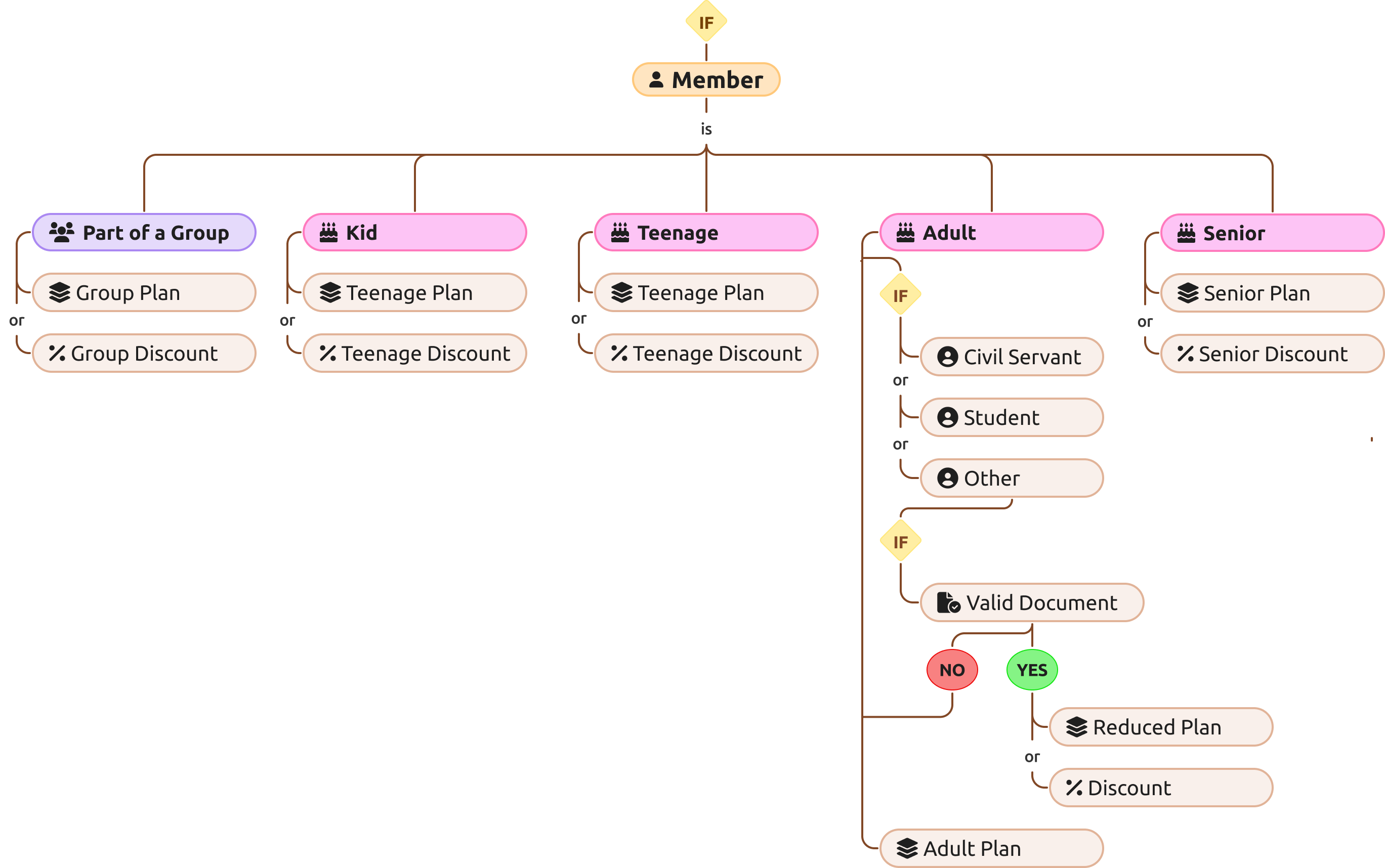
Club need a fully customisable automated invoicing system that factors in group membership, age, valid documents, special discounts, and more.
UX Strategy

1. plan tab redesign
Refine the UX/UI to improve clarity and consistency across the platform, while enabling upcoming features.
to significantly reduce Dev Team workload by minimising repetitive plan-related sales requests.
2. MVP Scope
Design automations based on age groups (the most frequent and time‑consuming change) to reduce manual effort and prevent errors, laying the groundwork for a more automated system.
Enabled bulk actions such as setting plan end dates and adding/removing members to streamline management and reduce administrative load.

3. Next steps
Implement automatic plan changes or discount application upon verification of member-uploaded documents, enabling clubs to fully automate their unique pricing structures.
challenge
The challenge was to design a solution that our small dev team could realistically build, while remaining flexible enough to meet diverse club needs.
It also required a thorough documentation to cover all possible edge cases.
UX/UI
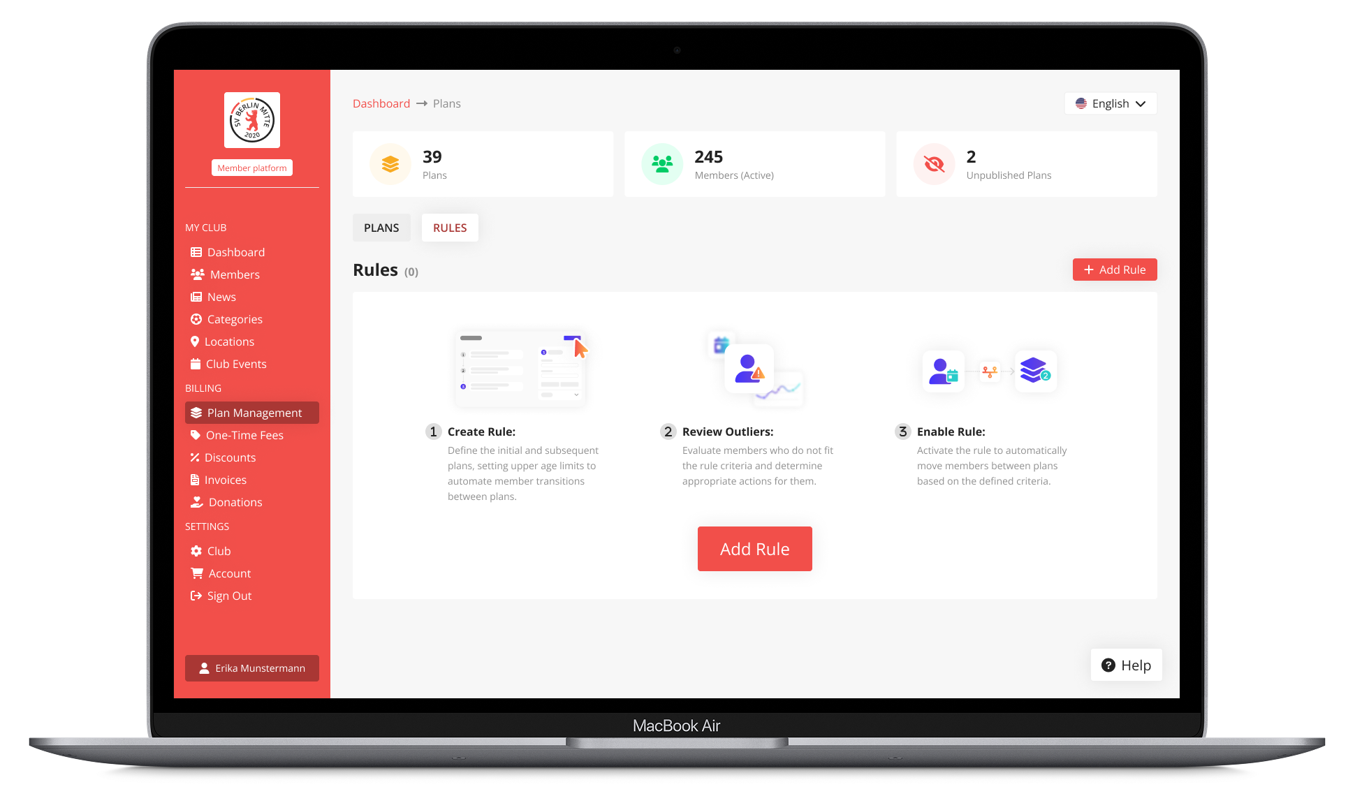
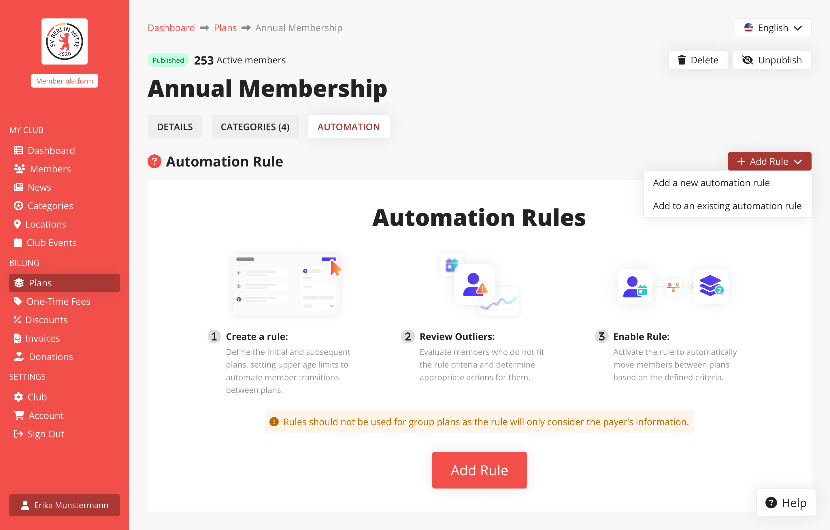
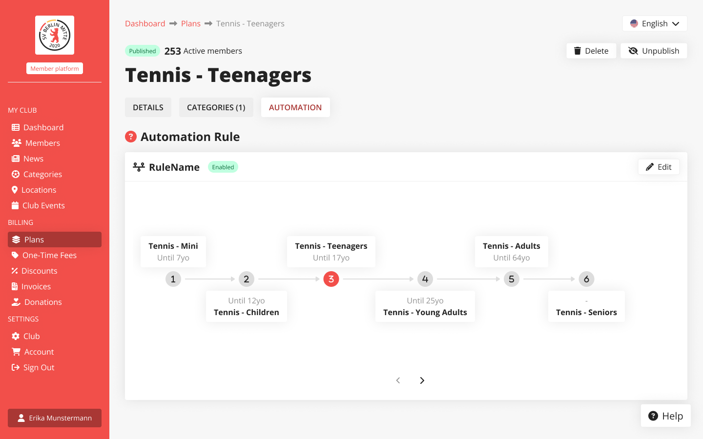
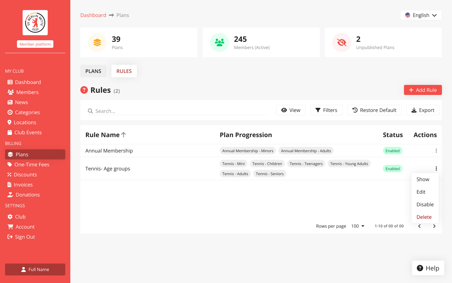
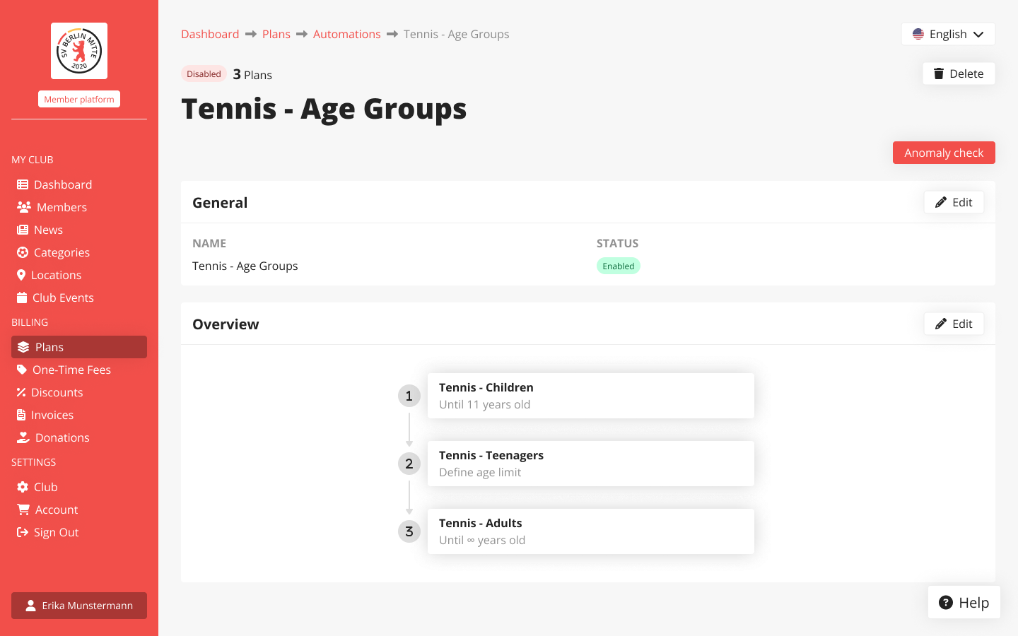
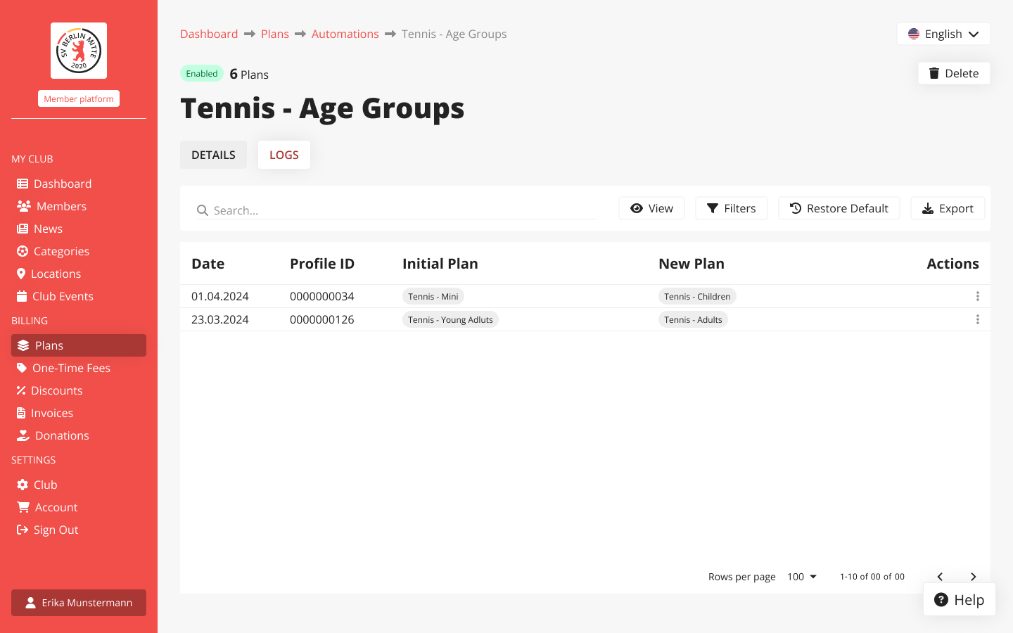
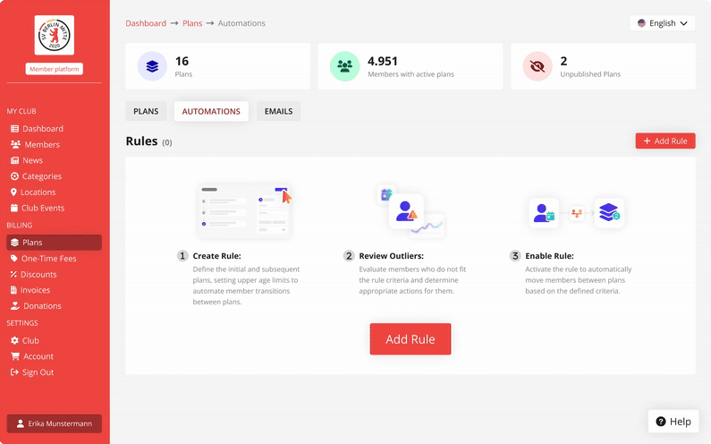
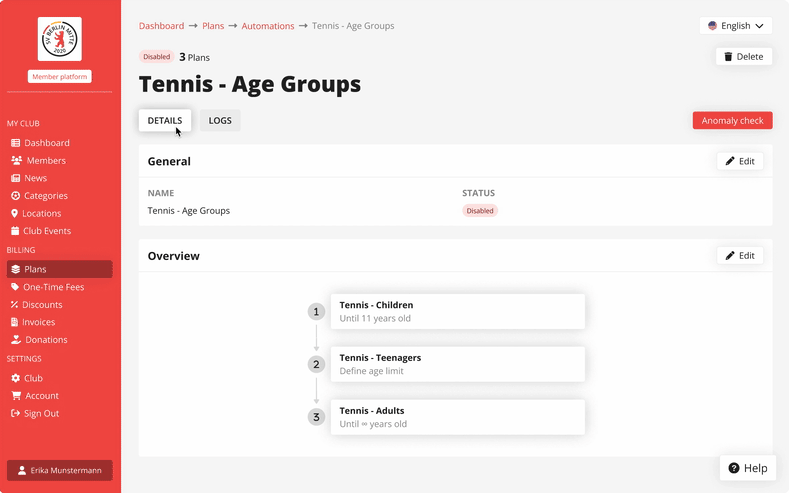
Automation rules are visible in four key places: the plan’s page, a centralised table listing all of the club’s automation rules, the rule builder and the automation's rule page.
plan page
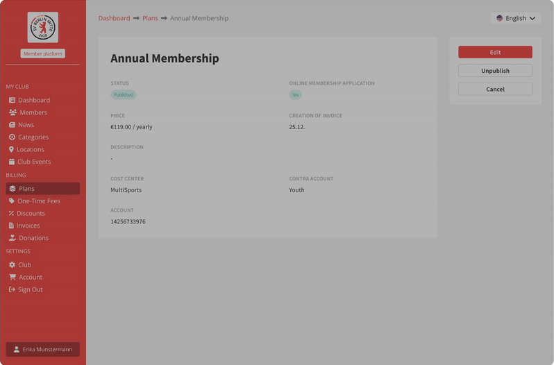
On each plan’s page, you can instantly see whether it’s part of a rule. If it is, you get a quick, clear overview of how the rule applies.
club's automation rules
All club rules are neatly organised in a dedicated table view. It’s a central place to manage, and track automations.
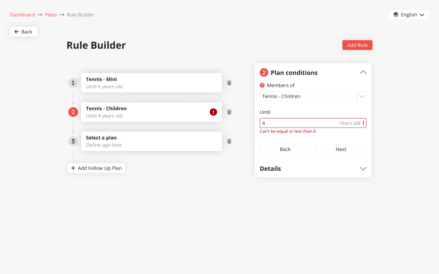
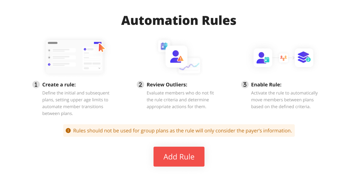
rule builder
The rule builder is the heart of the system. It’s intuitive, helps prevent errors like overlapping age groups, and makes setting conditions feel effortless.
It’s also built with flexibility in mind, ready to support other types of automations in the future.
rule page
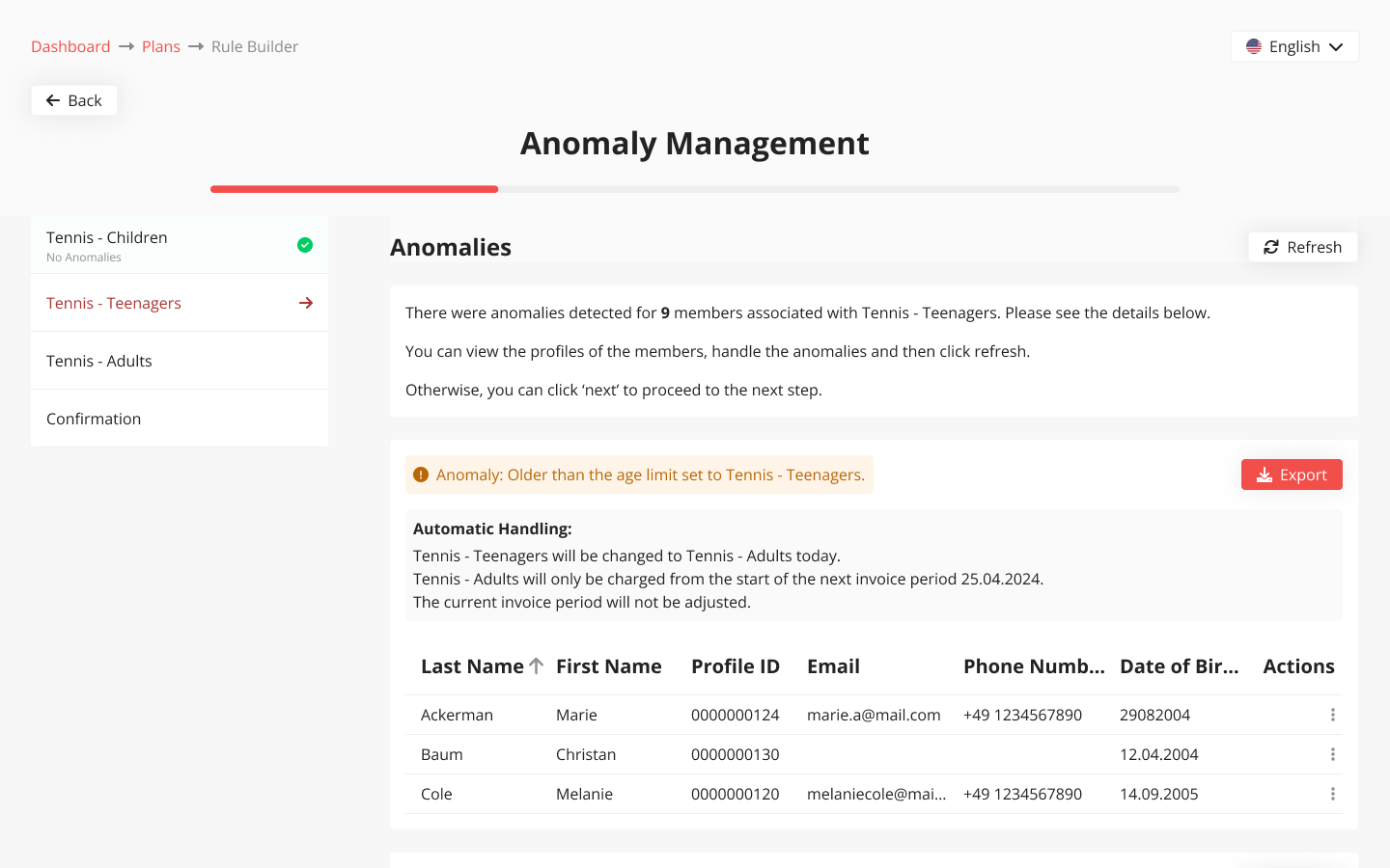
On the rule’s page, you can edit or toggle it on/off, review anomalies, and access logs of all past actions.
solution
Plan Tab redesign
I updated the UX/UI for greater consistency across the platform, introducing a tab-based structure that enables the implementation of new features, along with clearer error and info messages.
Before after
redesigned plan creation flow
Automations MVP - Age group
rule builder
The age group rule builder is the foundation of a fully customisable invoicing system.
It’s intuitive, easy to configure, and designed to simplify condition setup and prevent errors like overlapping age ranges.
Anomaly handling
Clubs can handle anomalies seamlessly, with flexible options for both manual and automated resolution.
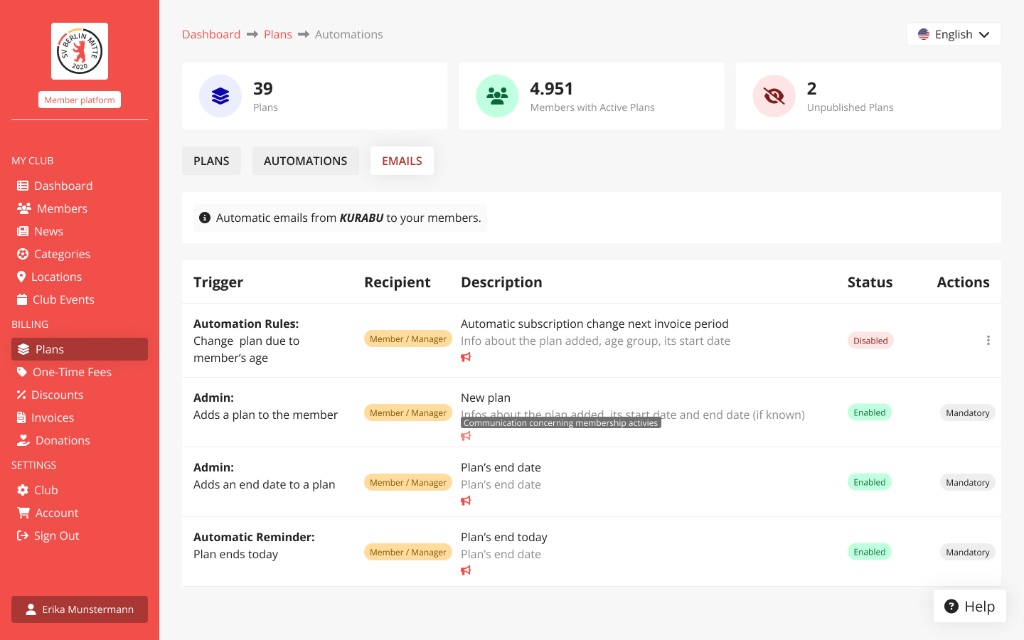
Members notification management
Admins can choose to turn member email notifications on or off when a plan change is triggered by an automation rule.
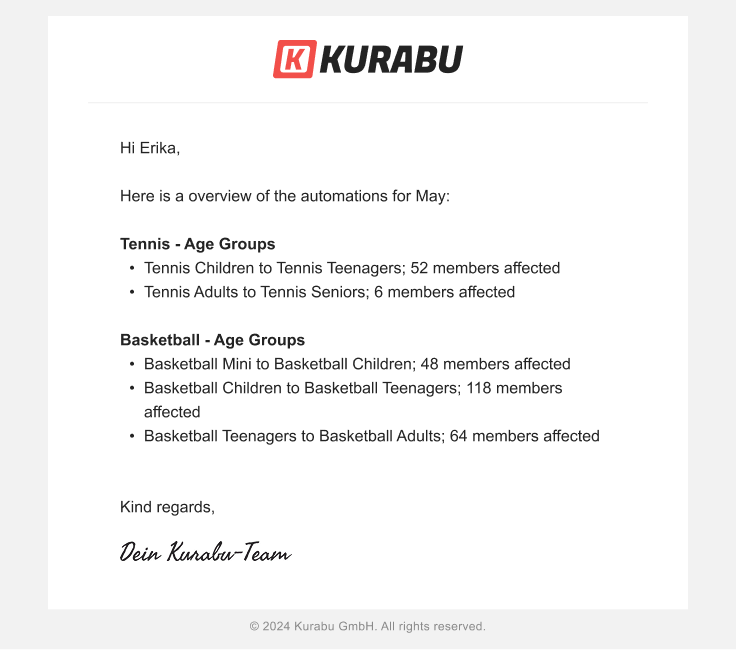
This is the MVP of a brand new feature I designed. Use case coming soon!
prototype
impact
Client growth
Automated Plans will help attract new clients, especially large clubs with complex and custom pricing needs, thanks to its flexible and automated setup.
reduced internal workload
Expected impact: 15-hour weekly reduction in administrative work and 70% decrease in manual errors across clubs.


Facets
Project Type
Brand identity and portfolio
Industry
Interior design
Role
UX/UI designer
Challenge
Design a distinctive logo and professional website that showcases the architect's unique style and converts visitors into prospective clients.
Outcome
Created comprehensive visual identity system featuring custom logo, fully responsive website, and graphic charter.
The cohesive brand experience successfully communicates the architect's design philosophy while driving client engagement.
Skills
UX/UI
Branding
Logo
Information architecture
overview
Context
Facets is the association of two architects. One specialised for business (Facets retail) and the other one for individuals (Facets design + build).
challenge
The challenge here was to create a branding that reflects the values of the company and to design a portfolio that highlights its achievements while carrying the architect’s style.
process
Research to-do:
- Survey & interviews
- Workshop with company
- Persona
- Competitive analysis
Define to-do:
- Company's values
- Company's needs
- Brand identity & website's goals
Design to-do:
- Low-fi & mid-fi wireframes
- UX writing & photo editing
- Iteration
- Interactive prototype
To deliver:
- Webflow website
- Logo
- Style guide
research
Research goal
Get to know the architects and their clients. Understand their values, goals, and expectations, ensuring the brand and portfolio reflect their unique identity and vision.
Who is facets?
After a long exchange and a workshop with the company’s members, we stated their needs and their brand values.
Company's needs
- design a logo
- establish a graphic charter
- highlight achievements
- attract clients
- get estate agents to recommend Facets
Company's values
- trustworthy
- modern
- stands out
- clean
Research findings
what potential clients want
Potential clients want to see the achievements. They do not read text when it's too long (4 lines is the maximum). They want to look at pictures.
How clients choose an interior designer
Clients choose by:
- word of mouth
- having seen their work at other's places
- by recommendation
Real estate agencies are in a strong position to recommend architects (business card and/or phone number).
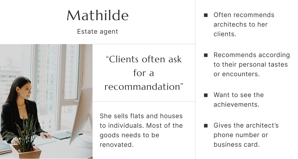
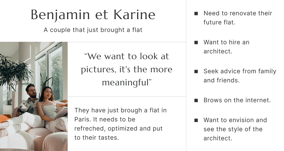
persona
According to the client’s need, I identified two types of users:
- the estate agent
- the individual (Facets clients)
I interviewed 15 different profiles, that might be interested in hiring or already as hired an architect.
Here are their personae:
logo
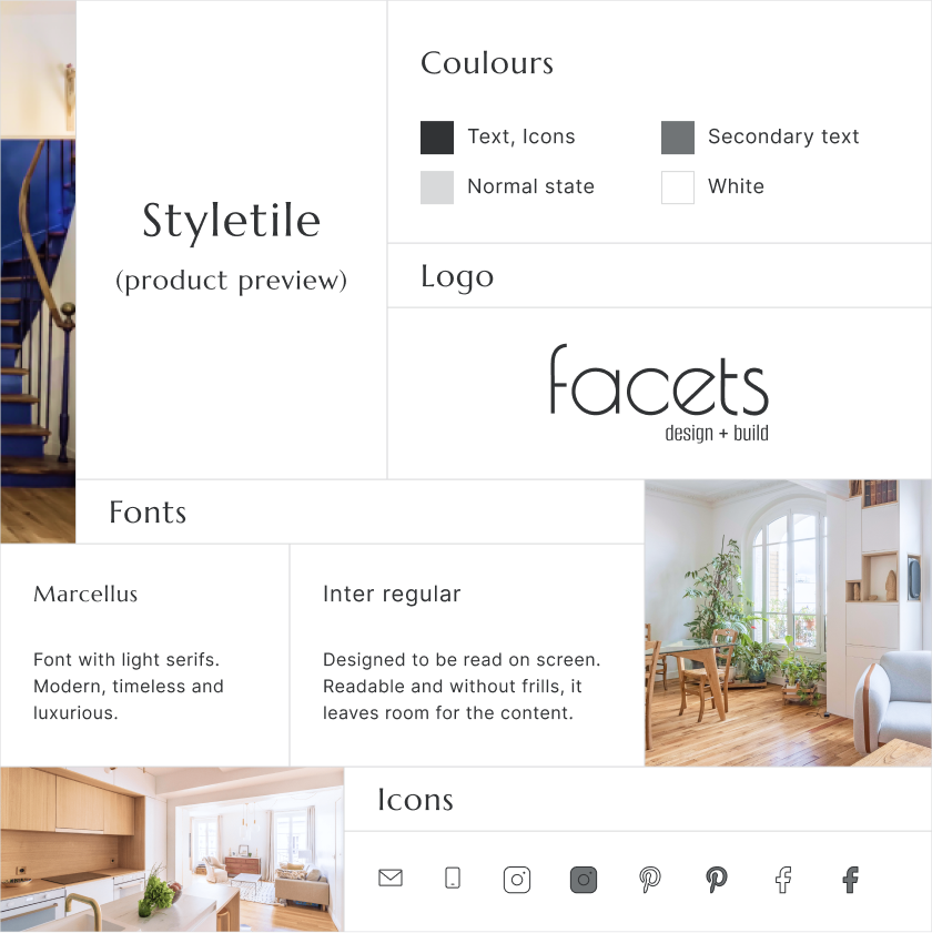
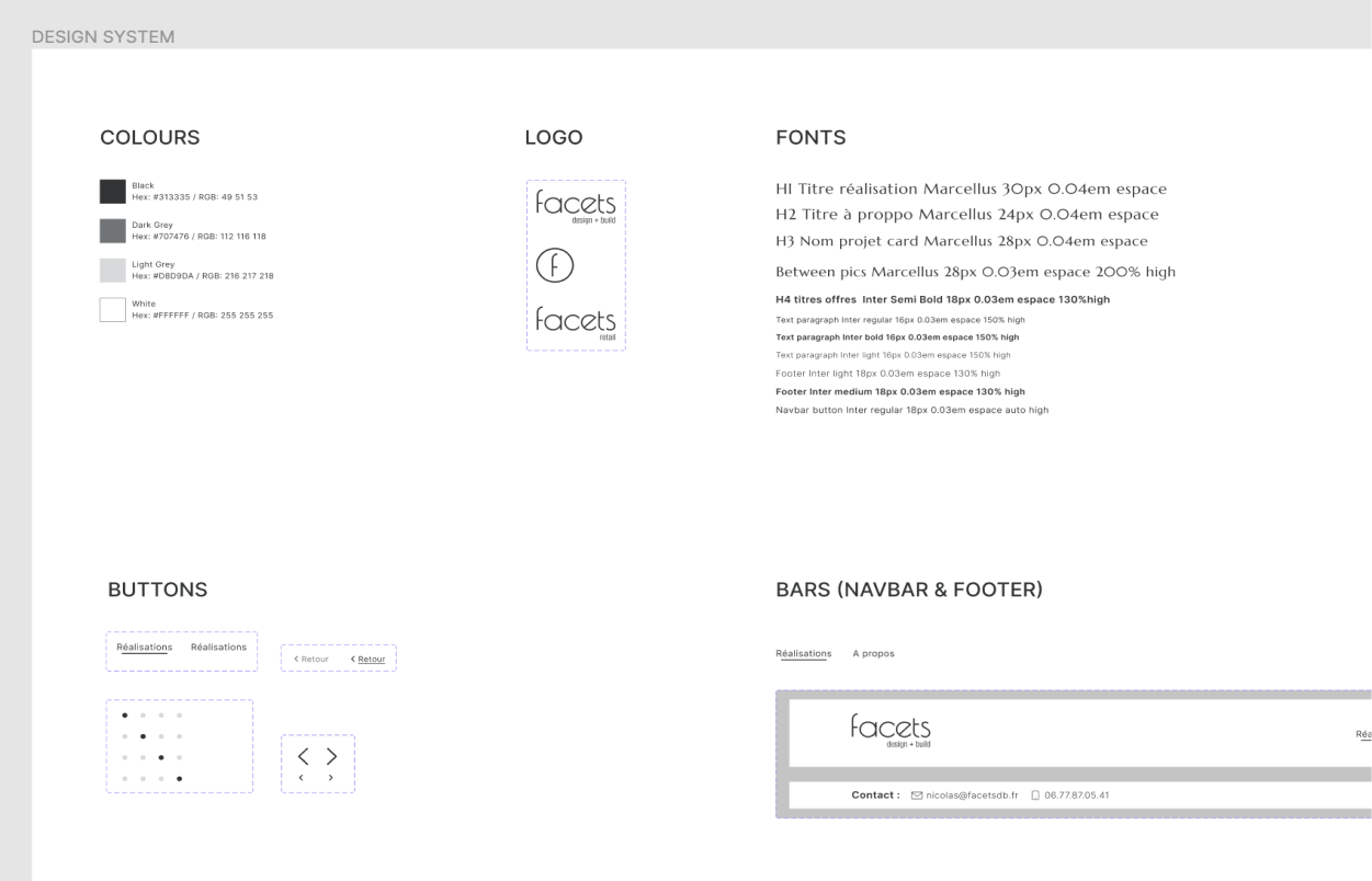
The rounded shapes are symbols of solution, flexibility, and perfection while the angular corners stand for trustworthiness.
web
Favicon

styletile
solution
With the brand’s values and users' wants and needs in mind, I came up with a solution through both UX and UI.
I wanted to create emotion and encourage the users to make contact.
UX (the walls)
I achieved this goal throughout the UX while:
- reducing the text to its bare minimum
- placing emphasis on visual content to create emotion
- facilitating the navigation from one project to another
- providing contact informations as often as possible
- creating a pictures' layout reminiscent of the architect's style
uI (Paint & Fournitures)
Here is how I translated the company’s values into UI:
Trustworthy:
- serif font for headers
- no-frills UI
- speech tone
Luxury:
- serif font for headers
- black & white UI
- clean interface
Modern:
- clean interface
- geometric shapes
- use of icons
Create Emotion:
- clean interface
- pictures' choice
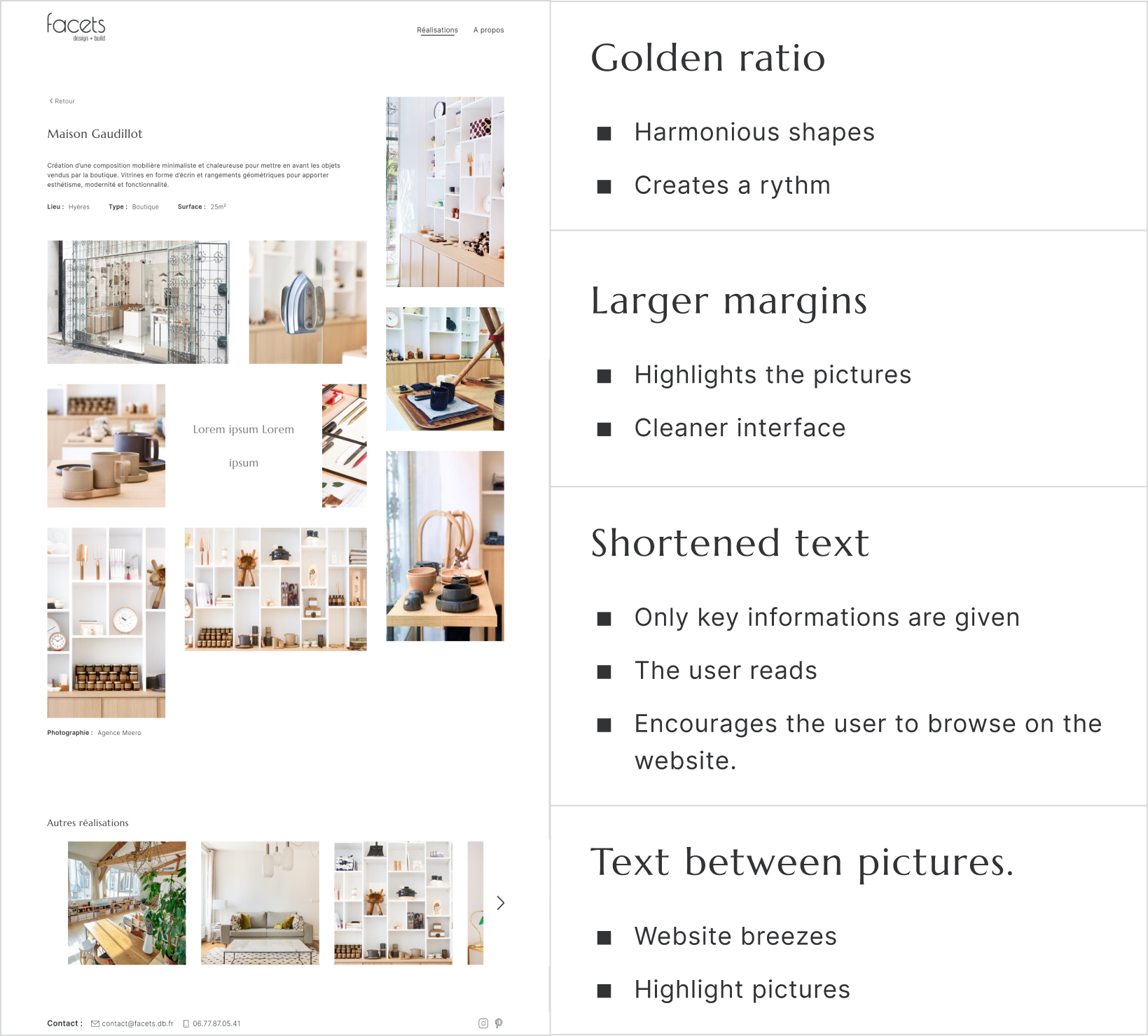
- use of the golden ratio
iterations
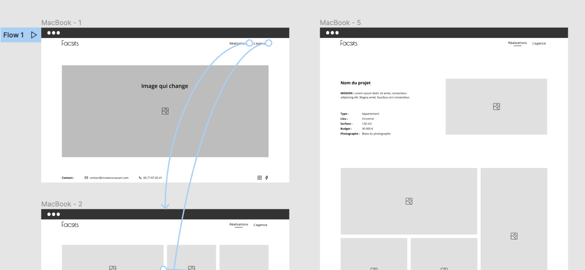
Here are the iterations of the project's page:
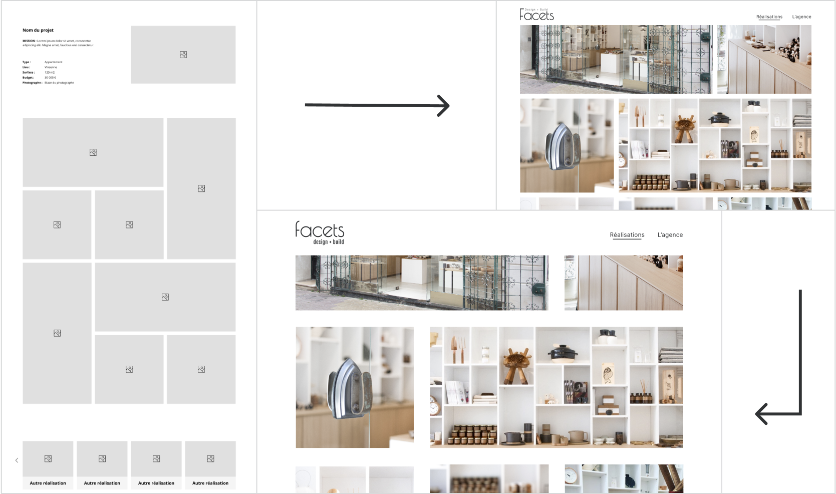
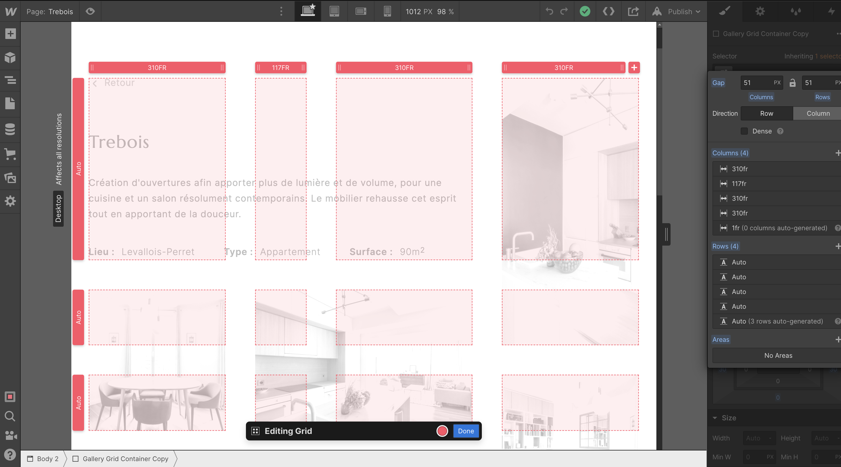
webflow implementation
I then implemented the prototype with Webflow.
The golden ratio-based grid gave me a hard time being fully responsive. It made me realise how a design can turn into a pain in the neck to implement.
I ask for advice from a friend who is a developer and here is what he told me: "I would try to figure out how to make all the pictures square".
As the soul of the design resides in its irregular grid which was appreciated by both the users and the company, I could not bring myself to break it.
After watching a few tutorials and trying a lot of different ways of organising the grid, I finally found a way that worked.
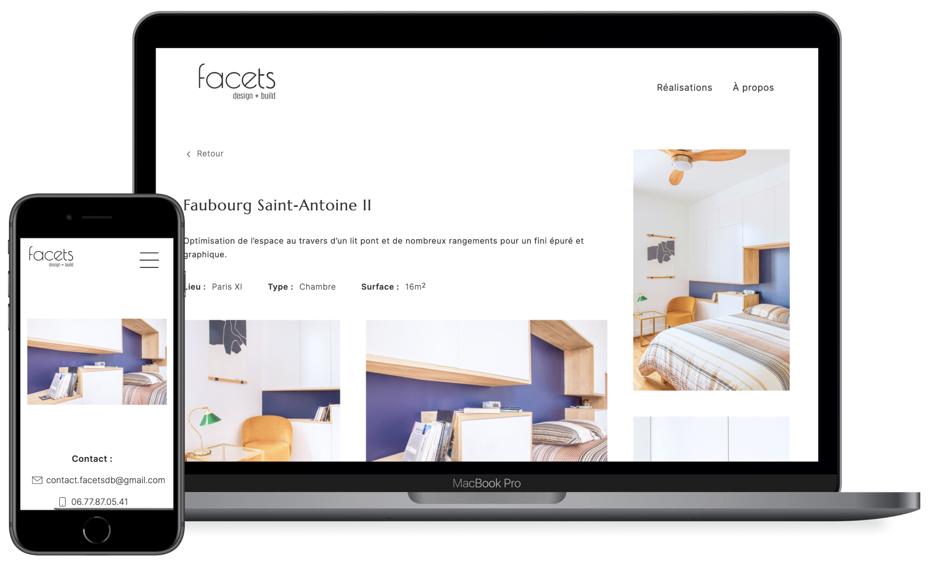
website
You can visit facetsdb.fr.
impact
This new website and graphic charter make it easier for the user to discover the company’s achievements and style. It also provides a trustworthy feeling.
Through the graphic charter, Facets gained credibility and now can communicate its values through a uniform way of communicating. The company's reliability is emphasised by having a professional website that reflects its style and personality.
next steps
With the brand’s values and users' wants and needs in mind, I came up with a solution through both UX and UI. I wanted to creaI designed Facets graphic charter so that it can be used on every communication means. I will help the company apply it on its business card and printed brochure, but also through its speech tone on social media.
I will also implement each new project in the future.
The next step for the website would be implementing an automated answer to clients when they make contact. te emotion and encourage the users to make contact.
take away
I also had the opportunity to practice empathy towards developers, when they are given a complicated design to implement.
With this project, I learned how to plan in advance how long a project will take me from user research until its implementation online.
other projects
Hello, I'm
Fatou-Anaïs
She/Her


I’m looking for my next role to keep doing just that.
Useful
joyful
well made
inclusive
These are the values that guide my work. I design to improve how people experience the world, solving real problems with simple and elegant solutions.
Collaboration gives me energy: diverse skills and perspectives create better products.
Curious by nature, I balance speed with care, designing with empathy, clarity, and inclusivity for lasting impact.
selected projects
coming soon

Motion design
Storytelling
Background
I didn’t take the usual path into design, and that’s my strength.
At Sacem, I saw how clunky tools could slow people down. I started asking questions, sketching better flows, and imagining software that worked for people, not against them. That curiosity became a career.
Before that, I managed music festivals and worked in retail: two fast‑paced, people‑focused worlds.
Festivals taught me to design for chaos, creating tools that stay simple when everything around is not. Retail taught me how to tailor experiences, making things both useful and appealing.
Now, I bring that mix of empathy, systems thinking, and adaptability to SaaS and fintech products. I like working within constraints, building tools and design systems that simplify work, include more people, and make everyday tasks a little more enjoyable.
Product designer
2022 - 2024

UX/UI designer
2021 - 2022 & 2025

Directory Manager
2017 - 2021

Stage & Festival Manager
2015 - 2021
Retailer & Merchandiser
2011 - 2015
References
“Anaïs took the time to deeply understand the problem (our goals, our users, and their environment), then effortlessly turned that insight into clear, beautifully crafted designs.”
Head of Product & Design
"Anaïs picks up new skills with impressive speed and brings a collaborative, thoughtful energy to every project.
Truly a joy to work with.”
UI/UX Designer & Frontend Developer
“From the very start, Anaïs brought a level of creativity, adaptability, and design maturity that exceeded all expectations, making an immediate impact on both the product and the team.”
Head of Engineering
"A big thank you to Fatou-Anaïs for her expertise, involvement and know-how."
Client